Using color theory in landscape design can transform your outdoor space, making it more inviting and visually appealing. By understanding the basics of color theory, you can create harmonious combinations that enhance the natural beauty of your garden. Start by choosing a color palette that reflects your personality and the atmosphere you wish to create. Consider the different roles colors play—cool colors like blues and greens evoke tranquility, while warm colors like reds and yellows can add energy and excitement. Experiment with contrasting and complementary colors to find the perfect balance. With thoughtful application of color theory, your landscape can become a stunning reflection of your style, turning your yard into a beautiful and cohesive environment.

“`html
How To Use Color Theory Landscape Design
Color theory is a powerful tool that can enhance any landscape design. Understanding how colors interact can help you create beautiful, cohesive, and engaging outdoor spaces. This guide dives into color theory and how it applies to landscape design, giving you the insights you need to make your garden shine.
Understanding Color Theory
At its core, color theory is the study of how colors interact. It involves the color wheel, which displays the relationships between colors. The color wheel is divided into three main categories: primary, secondary, and tertiary colors.
- Primary Colors: Red, blue, and yellow are the building blocks for all other colors.
- Secondary Colors: Green, orange, and purple are created by mixing primary colors.
- Tertiary Colors: These are made by mixing primary and secondary colors, like red-orange or blue-green.
Understanding these categories helps you in selecting colors that work well together.
The Color Wheel and Its Relevance
The color wheel is not just a tool for artists; it’s also vital for landscape designers. It helps you visualize how colors relate to one another. For instance, colors opposite each other on the wheel are complementary and create vibrant contrasts.
Complementary Colors
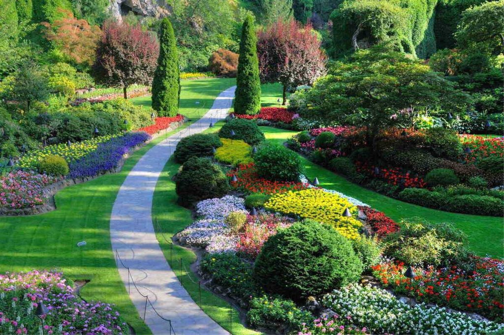
Complementary colors can make elements in your garden stand out. For example, planting green foliage next to red flowers can create an eye-catching display. Remember:
- Green and red
- Blue and orange
- Purple and yellow
These combinations draw attention and add energy to your landscape.
Analogous Colors
Analogous colors sit next to each other on the wheel. These combinations create harmony and are visually pleasing.
- Yellow, yellow-orange, and orange
- Blue, blue-green, and green
- Purple, purple-red, and red
Using analogous colors can create a calming effect in your landscape design.
Warm vs. Cool Colors
Colors can also be classified as warm or cool. Warm colors include reds, oranges, and yellows. These colors evoke energy and warmth, making spaces feel more inviting.
Cool colors, such as blues, greens, and purples, provide a calming and relaxing atmosphere. Understanding the mood you want to create is crucial in choosing your color palette.
Using Warm Colors
Warm colors can draw attention and can be used effectively to highlight specific areas in your garden.
Consider using them around entrance points or patios. They encourage social interactions and make spaces feel cozier.
Using Cool Colors
Cool colors can make areas feel more spacious and serene. Use them effectively in quiet zones, like meditation gardens or relaxing seating areas.
Incorporating blues and greens can create a peaceful retreat amidst a busy environment.
Creating Focal Points with Color
Focal points are essential in landscape design. They draw the eye and provide interest. You can use color to create these focal points.
Here are some ways you can do this:
- Use bright-colored flowers in a sea of green foliage.
- Incorporate colored pots or garden accessories.
- Highlight garden sculptures or features with contrasting colors.
Color contrasts can make specific elements stand out, providing an engaging visual experience.
Seasonal Color Considerations
When designing your landscape, think about seasonal variations. Different plants bloom at various times of the year, and their colors can dramatically impact your landscape’s look throughout the seasons.
Spring and Summer
Spring brings vibrant blooms. Consider colorful flowers such as tulips, daffodils, and irises to create a cheerful atmosphere.
In summer, plants like marigolds, sunflowers, and zinnias can add warmth and brightness.
Autumn and Winter
Autumn showcases beautiful warm hues like orange and red with plants like chrysanthemums and ornamental grasses.
In winter, greens and whites can provide a dramatic landscape, especially if you incorporate evergreens or winter-blooming plants.
Combining Textures with Colors
In addition to color, incorporating different textures enriches your landscape.
Combine smooth and rough surfaces for a balanced look. For instance, pairing soft, feathery plants with bold, spiky structures can create stunning contrasts.
Layering Techniques
Layering plants can also enhance your color scheme. Place taller plants in the back and gradually shorter plants to create depth. This technique allows colors to blend and interact positively.
Using Color in Hardscaping
Color theory is not limited to plants. Hardscaping features such as patios, walls, and pathways can incorporate colors too.
Consider using colored bricks or pavers that complement or contrast with the plant colors.
Material Choices
Different materials can provide various colors and textures. For example:
- Natural stone offers earthy tones.
- Concrete can be dyed in various colors.
- Wood adds warmth and texture.
These choices can enhance the overall mood of your landscape.
Lighting and Color
Lighting plays a crucial role in how colors appear in your landscape. The right lighting can make colors pop or create soft, soothing effects.
Types of Lighting
When it comes to lighting, consider different types:
- Spotlights: Highlight specific plants or features.
- String Lights: Add a warm glow to patios.
- Path Lights: Guide visitors while adding safety.
Your choices can change the atmosphere of your garden at night.
Choosing the Right Color Palette
Selecting a color palette can be challenging but is essential for creating a cohesive landscape.
A good tip is to limit your palette to three primary colors. This approach simplifies the design process and ensures harmony.
Testing Color Combinations
Before making permanent decisions, test color combinations in your design. Consider creating a mood board using photos, samples, or even drawing your layout.
This can help visualize how different colors will look together in your outdoor space.
Common Mistakes to Avoid
Even experienced designers can make mistakes when applying color theory. Here are some common pitfalls:
- Overcomplicating Color Choices: Stick to a simpler palette.
- Ignoring Seasonal Changes: Plan for how colors will evolve throughout the year.
- Neglecting Texture: Ensure a mix of textures to avoid a flat look.
Being aware of these mistakes can lead you to better choices in your design.
The Role of Personal Preference
While color theory provides guidelines, personal preference is equally important.
Your landscape should reflect your style and taste. Don’t hesitate to incorporate your favorite colors or elements that resonate with you.
Incorporating Local Climate
Finally, remember to consider your local climate. Certain plants thrive in specific conditions. Ensure your color palette includes plants suited for your environment.
Researching local flora can help you make informed decisions while also enhancing your design with regional colors.
Using color theory in landscape design allows you to create beautiful, harmonious outdoor spaces. By understanding the relationships between colors and incorporating them thoughtfully, you can elevate the appeal of your landscape. Your garden can become a reflection of your personality, a haven of peace, and an inviting space for all to enjoy. Enjoy the journey of designing your colorful landscape!
“`
Using Color Theory in Garden Design
Frequently Asked Questions
“`html
What are the primary color schemes in landscape design?
The primary color schemes in landscape design include monochromatic, analogous, and complementary. Monochromatic schemes use variations of a single color, creating a harmonious feel. Analogous schemes incorporate colors that are next to each other on the color wheel, providing a serene and cohesive look. Complementary schemes pair colors opposite each other on the wheel, adding visual interest and vibrancy to the design.
How do seasonal changes affect color choices in landscape design?
Seasonal changes significantly impact color choices in landscape design. Plants bloom at different times, bringing varying colors throughout the year. For example, spring may feature vibrant blossoms, while autumn showcases rich, warm hues. Selecting plants that offer color throughout different seasons can create a dynamic landscape that remains visually appealing all year round.
What role does lighting play in the perception of color in landscapes?
Lighting plays a crucial role in how colors appear in landscapes. Natural light can change the hue and saturation of colors at different times of the day. For instance, morning light often makes colors look softer, while harsh midday sun can intensify colors. Understanding how light interacts with colors helps designers select plants and materials that will look their best in the intended environment.
How can I create depth using color in my landscape design?
Creating depth in landscape design involves using color strategically to draw the eye into the space. Darker colors can recede, making areas appear further away, while lighter colors advance, bringing features closer. By placing darker plants or elements in the background and lighter ones in the foreground, you can create a sense of depth and dimension in your landscape.
What common mistakes should I avoid when applying color theory in landscape design?
Common mistakes include overusing vibrant colors without balance, which can overwhelm the eye, and neglecting to consider how colors interact with one another in different lighting conditions. Additionally, failing to think about seasonal color changes can result in a landscape that looks lackluster at certain times of the year. Aim for a balanced palette that complements your overall landscape aesthetic.
“`
Final Thoughts
Using color theory in landscape design enhances visual appeal and harmony in outdoor spaces. By selecting complementary colors, you can create vibrant focal points that draw attention and evoke emotion.
Incorporating various shades and textures adds depth to your landscape. Balance warm and cool tones to maintain a serene atmosphere while showcasing your style.
Ultimately, understanding how to use color theory landscape design will help you craft beautiful, inviting environments that resonate with your vision and the natural surroundings.